
How To Create Iconic Album Artwork
You album art is often the first point of interaction between an artist and their audience. It’s more than just packaging; it’s a visual representation of the music, an expression of the artist’s vision, and a critical marketing tool. An iconic album cover can leave a lasting impression and become a part of pop culture. So, how do you create an iconic album cover? Here’s a comprehensive guide to help you design an album cover that stands the test of time and resonates with your audience.
Align with the Music’s Theme
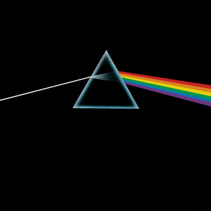
The album cover should be a visual extension of the music it represents. To achieve this, start by deeply understanding the themes, emotions, and stories conveyed in the album. Is the music upbeat and energetic, or is it introspective and somber? Use this understanding to inform your design choices. For example, Pink Floyd’s “The Dark Side of the Moon” features a prism dispersing light, symbolizing the album’s themes of complexity and the human experience. This iconic cover perfectly aligns with the album’s musical and lyrical content, creating a cohesive artistic statement.
Consider Record Bin Visibility

In a physical record store, your album art needs to stand out in a crowded bin. Think about what your cover will look like when partially obscured or displayed alongside many other albums. Bold, contrasting colors and striking imagery can help your album catch the eye. Additionally, consider how your cover design will fit within a series of releases. If you’re planning multiple albums, having a consistent visual theme can create a recognizable brand identity, much like how The Beatles’ “Sgt. Pepper’s Lonely Hearts Club Band” has a distinct yet cohesive visual style.
Timeless Art Over Flashy Trends

Trends come and go, but timeless album art endures. Aim for a design that will remain relevant and appealing for years to come. Avoid overly trendy fonts, colors, or design elements that may quickly become dated. Instead, focus on classic design principles: balance, contrast, harmony, and simplicity. Joy Devision’s “Unknown Pleasures” is a prime example of timeless design. Its simplicity and elegance have made it one of the most recognizable album covers in history.
Correct Side Spine Orientation
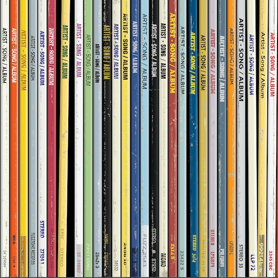
One often-overlooked detail is the orientation of the side spine text. Ensure that the text on the spine of your album art is oriented correctly so that it’s easily readable when stored on a shelf. This small but significant detail can greatly enhance the user experience. Incorrect spine orientation can be a major annoyance for collectors and fans, detracting from their overall enjoyment of the album.
Mindful Sticker Placement
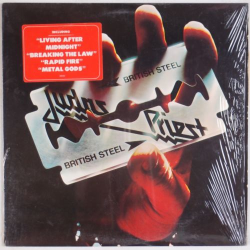
Stickers can be a useful tool for promoting special features or editions of an album, but they should be used judiciously. Make sure any stickers placed on the album cover do not detract from the album artwork. A well-placed sticker can enhance the overall presentation, while a poorly placed one can obscure important design elements and disrupt the visual flow. Consider using transparent or subtly designed stickers that complement rather than compete with the cover art.
UPC Placement
The placement of the Universal Product Code (UPC) is another important consideration. Rather than integrating the UPC into the cover art, which can disrupt the visual aesthetics, place it on a removable sticker. This allows the cover art to remain unblemished and keeps the design clean and cohesive. Fans and collectors will appreciate the thoughtfulness of this decision, as it preserves the integrity of the artwork.
Material and Finish Considerations
The choice of materials and finishes can significantly impact the appearance and feel of the album cover. Different finishes, such as uncoated stock, high gloss, or matte, can change the way colors and images appear. Uncoated stock may mute colors, giving a more subdued and classic look, while high gloss can make colors pop and add a modern sheen. Matte finishes offer a subtle, sophisticated texture. Consider how these finishes will affect the overall presentation and choose one that best complements your design and the album’s theme.
For vinyl orders of 250+ units, we have multiple different finishes to choose from!
Maintain Balance
A well-balanced design is pleasing to the eye and effectively communicates the intended message. Balance involves the distribution of visual elements such as color, light, and texture. Ensure that no part of the cover feels too heavy or too light. Symmetrical designs are inherently balanced, but asymmetrical designs can also achieve balance through careful arrangement of elements. The goal is to create a harmonious composition that draws the viewer in and keeps them engaged.
Practical Tips for Designing Album Art
Start with a Clear Concept: Before diving into the design process, start with a clear concept. Understand the album’s themes and the artist’s vision. Sketch out ideas and experiment with different layouts and elements. This foundational work will guide your design decisions and ensure that the final product aligns with the album’s essence.
Collaborate with the Artist: Collaboration between the designer and the artist is crucial. The artist’s input can provide valuable insights and help ensure that the cover accurately reflects their vision. Regular communication and feedback loops can lead to a more cohesive and satisfying final product.
Use High-Quality Images and Graphics: Whether you’re using photographs, illustrations, or graphic elements, ensure that they are high quality. Low-resolution images can appear pixelated and unprofessional when printed. Invest in professional photography or high-resolution stock images if necessary.
Typography Matters: Typography plays a significant role in the overall design. Choose fonts that complement the artwork and the music’s theme. Ensure that the text is legible and appropriately sized. Avoid using too many different fonts, as this can make the design look cluttered and inconsistent.
Mockups and Prototypes: Create mockups and prototypes to see how the cover will look in various contexts. Print physical copies to check how the design translates from screen to print. This step can help identify any issues with colors, alignment, or legibility before the final print run.
Gather Feedback: Before finalizing the design, gather feedback from a small group of trusted individuals. This could include the artist, members of the band, or even a focus group of fans. Constructive feedback can provide new perspectives and help refine the design.
Consider the Whole Package: Remember that the album cover is part of a larger package. Consider how the design will work across different formats, such as digital thumbnails, vinyl, CDs, and promotional materials. Consistency across all platforms will strengthen the overall branding.
Incorporate Personal Touches: Adding personal touches or unique elements can make the album cover more memorable. This could be a hidden detail in the artwork, a special message in the liner notes, or a unique fold or die-cut in the packaging.
Conclusion
Creating an iconic album cover is a blend of art, strategy, and attention to detail. It requires a deep understanding of the music, a clear vision, and a thoughtful approach to design. By aligning the cover with the album’s theme, considering how it will look in various contexts, prioritizing timeless art, ensuring proper orientation and placement of elements, choosing the right materials and finishes, and maintaining balance, you can create an album cover that stands out and endures.
Figure out the main focus using one of these categories as your centerpiece:
- A strong image or photograph: A compelling image can convey the album’s mood and themes powerfully. Think of iconic covers like The Beatles’ “Abbey Road” or Nirvana’s “Nevermind,” where the images are instantly recognizable and deeply connected to the music.
- A tasteful combination of color and texture: Using color and texture effectively can create a visually striking cover that grabs attention. For example, the bold colors and textures of Prince’s “Purple Rain” or the minimalist yet textured design of Pink Floyd’s “The Dark Side of the Moon.”
- Very intentional and artistic typography: Typography can be the focal point of your design, as seen in albums like The Rolling Stones’ “Sticky Fingers” or Kanye West’s “Graduation.” Thoughtful use of typography can convey a lot about the music and the artist’s style.
Using one of these categories as the main theme of your design, instead of taking a kitchen sink approach, tends to have a cleaner and more direct result that will leave a lasting impression with the audience.
Remember, the album cover is more than just a piece of art; it’s a visual representation of the music and a crucial part of the listener’s experience. Take the time to get it right, and you’ll create a lasting impression that resonates with fans and becomes a cherished part of their music collection.
Whether you’re an artist, a designer, or a label, these guidelines will help you create an album cover that not only catches the eye but also captures the essence of the music within. Happy designing!